5 Must-haves For A Successful F&B Website
 If you own a restaurant, food kiosk, catering service or other food and beverage brand, one of your marketing goals will be to build a viable web presence. Here are 5 pointers you should take note of to create an effective, customised website to get your sales rolling!
- Optimised for mobile
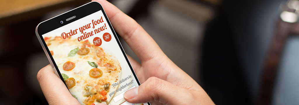
Many consumers use their mobile devices to browse websites on-the-go everyday, which is why all websites should be responsive and mobile-optimised! As an F&B brand, having a synchronised mobile-friendly website ensures you don’t miss out on potential sales, plus builds a better brand image if you offer a consistent experience across different devices. Do make sure that important information like contact details, location and opening hours are prominently displayed for easy access.
- Mouthwatering photos
Having attractive food photos creates a palatable website which in turn makes it more tempting for your customers to take action! Professional food styling and photography is a worthwhile investment, as food visuals not only engages your audiences more, but can also help build your brand image by creating a positive first impression. Enticing food photos also eliminate any language barriers as delicious food speaks for itself! You can also consider photos and even videos of behind-the-scenes food preparations in the kitchen, which evokes a sense of confidence in consumers (think handmade foods in-the-making, or baked products rising in the oven), and are often highly shareable.
- Memorable menu design
What is an F&B brand without a menu for quick reference? Similarly, a digital menu serves as a great point of contact for your customers, and all relevant information should also be included, such as food ingredients, nutritional insights and allergens (if any), and even recommended food pairings. As the best sales representative, your digital menu can impress and help drive decision-making for customers, thereby boosting your sales revenue.
Excite customers to make your order with a visual appealing menu, and add value for customers and prospects with a well-presented menu where the nutritional information is highly searchable.
- Clean, functional layout
Having a clean look and feel is important for an F&B website, whether you are providing an upmarket dining experience or serving customers through a quick-service kiosk. Create the right atmosphere for your customers and give them a feel-good factor with a professionally designed and optimal website experience. Whether you use full-size images or even striking animations, an uncluttered look and layout will draw focus to key elements and the foods you offer!
- Unique brand personality
Your website is a great opportunity to engage with visitors, so distinguish your brand with a unique visual identity to create a lasting impression! Pair stunning visuals and tell the story of your brand by building a website that complements your core values. Communicate your brand promise through the use of natural imagery if your brand uses ethically sourced ingredients, play with warm colours if you are a traditional family restaurant, or use a dark colour scheme with minimal text if you want to channel the cool vibes – it all depends on who you are, and which specific consumer segment you want to reach out to!
Never let layout and design get in the way of functionality, as your website should always be easy to use. Get in touch with us to start planning and crafting a customised website for your F&B brand today!
